Monday, October 21, 2013

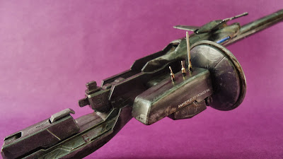
CUSTOMS: MG ZETA PLUS C1 RECON TYPE


     Here's an old custom I made. Basically it's a color scheme repaint, with minor detail up using IC(integrated circuit) round socket pins.


Model kit used:

BANDAI 1/100 MG Zeta plus C1

Paint used:

acrylic matt black
acrylic matt white
acrylic matt gray white
acrylic clear blue
acrylic clear red
enamel chassis black

Decals used:

stock dry transfer decals

Stickers used:

main camera, back camera, barrel mount on both sides of smart gun.


Personal thoughts:

It was a good build. it had a lot of seamlines and parts were not well molded to compliment flat parts, especially the tail stabilizer, but that did not hinder the scheme in this custom.


I went for a reconnaissance type mobile suit because it had that feel as a mass produced variant. inspired by armored core and transformers, i went for a realistic look of scratches and chipping, similar to armored core units, while following a similar paint scheme as to an alternate colors version of thunder cracker from transformers G1. the blue flair on the tail is a personal touch applied as part of my custom signature.


the metal pins were an excellent add on. although exaggerated on the main thrusters, i think it gave it a more distinct look and feel as a futuristic approach.


the oil leaks were initially intended as a minor detail app. but i decided to go fully greasy as it gave it an over-used or over-exerted suit pushed to it's limits and was just recently recovered.


i avoided the topic of applying battle damage for i considered this as a mobile suit that sees 'less action' and is mainly concerned with going in and out of the red zone as fast as it could. thus giving it the overly scratched armor indicating fast travelling ang less fighting.


although the C1 outfit was equipped with a beam smart gun, it only acts as an insurance rather than an outright weapon of choice.

Recommendation:

i recommend this kit to 'experienced' modelers. this is a transforming suit, very delicate and takes a lot of patience. i give it a 8/10 rating, considering it an early release. overall i am very satisfied. i'm even considering getting a 2nd C1 for my next custom. ;)


CIAO!

Sunday, October 20, 2013

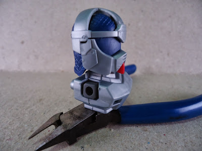
REVIEW: Y Model SD Knight Gundam


     The kit looks good at standing pose/ display pose. And it's only good for that. For poseability, very limited, as per not only the design, but the kit itself is the problem. Considering that this is a knockoff.

The Box:

box art looks nice. minus the obvious cover up of the original writing.

The Contents:

as per normal contents, this is all you'll get in an SD kit.

the runners look nice. not so cheap as per quality, a little too thick even.

I like the  red on this, it's not glossy. kinda really feels like cheap now.

I expected it to come in chrome plated parts. but normal silver will do.

so it only came with 1 chrome plated part. at least the stickers look nice

the usual comic strip/manual gimmick.

looks pretty normal to me. except for the elaborate chinese cover up text

or so I thought. the print is upside down. it's really not an issue though


The Build:

Main body parts:
the blue parts look really solid. but it's too solid the parts are too big for each other

those are some really bad looking seamlines

the gray parts really look dull.

the chest looks good. but again the seamlines look really bad on this kit

the ball jointed shoulders give good articulation, but it easily pops out if you go way too far.

the arms are not that bad. a little paint here and there and it'll start to look awesome.

the hips is too tight, and that's bad. the legs are too loose, and that's even worse.

Armor parts:
the chrome visor now looks bad when put onto the helmet. it became too blunt

the shoulder and armguards look fantastic. it's solid and i think it'll fair well overall

the skirts look flimsy, especially the side skirts. the connectors are almost gone

the breastplate looks good, i like it's simplicity. the mantle is awesome with it's ball jointed swing out gimmick.

with everything attached, it actually does look really well.

those flimsy legs really get in the way. the pegs are too loose.

Weapon parts:
the shield and sword, not your typical design. it's solid but I find it's too stiff.

the lance looks really awesome. but, alas, pegs are too big to give it any grace.

all suited up and ready to rumble. not bad for a SD kit.

Option parts:
some horse legs to complete the knight. I swear could have expected an actual horse and not this.

well the look works for this kit. but now it's all flimsy, not just the legs, but mainly it is because of the legs.


     The build was fun, I actually got a kick out of building this one. I think I'll enjoy modding this one. Again the parts are too big for each other. I blame the molding on this kit, they didn't adjust the proportions. The pegs are especially worse. You have to trim down most of them, but that won't be an issue to the casual modeler.

The Rating:

Quality - 7/10
Articulation - 6/10
Poseability - 5/10
Overall - 6/10

     The kit looks great by itself, but with a little modding here and there, and a little paint app, this might actually prove to be a worthwhile kit.


I got this kit from Zero Gravity Hobby Shopp


CIAO!